Elements Of Digital Graphics
Lines- can be long or short, thick or thin, straight or curved, and may travel in a horizontal, vertical or diagonal direction. In CSS, a border may be solid, dashed, dotted or doubled.
Lines may be used as borders to divide areas of the site layout, or to lead the eye in a particular direction.
Shapes- you may wish to use a shape as part of your site logo, or as an element in a content header. Don’t limit yourself to only thinking of two-dimensional circles, squares or triangles; stars, spheres, and polygons can also be excellent motifs in a site design.

Texture- many websites use a solid coloured background, but a textured image which evokes a particular feeling can create added visual interest when used well.

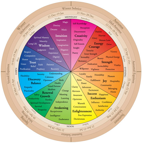
Colour- can be used to attract attention, to convey information and to evoke an emotional response.
Harmonizing/Adjacent Colours, which are very close in shade, but can lose impact when placed next to each other in a design
Complementary/Contrasting Colours, which have a few shades between them, and can work well if not used directly next to each other
Clashing Colours, which are opposites on the Colour Wheel, but can work well together if used in moderation


No comments:
Post a Comment